I still remember the first time I watched a dashboard go from static spreadsheets to a living interface that seemed to answer questions before I asked them. I was a sleep-deprived analyst back then, cobbling SQL queries at midnight when I realized: the future of insight isn’t more charts—it’s smarter charts. In this post I’ll walk you through how I would (and did, in an imagined retelling) build a first AI-powered business intelligence dashboard: from picking the right connectors to teaching a dashboard to speak plain English. Expect honest trade-offs, a few tangents, and the occasional coffee-shop analogy.
Why AI-Powered Business Intelligence Dashboards Matter (Key Features)
Speed + context beat static reports (the decision gap)
When I used to rely on weekly reports, I often saw problems after they already hurt revenue. That time lag creates a decision gap: the business changes daily, but the report only updates when someone exports it. An AI-Powered Business Intelligence Dashboard closes that gap by refreshing key numbers fast and adding context—like what changed, where it changed, and what might happen next.
From passive charts to proactive assistants
Traditional dashboards are like wall posters: useful, but they wait for me to notice something. AI shifts the dashboard into a helper that can surface automated insights. Instead of scanning 20 charts, I can get alerts such as “conversion dropped 12% in mobile checkout after the last release” or “inventory risk rising for top sellers.” The best part is that the dashboard can explain the “why” in plain language, not just show a spike.
Quick story: a small retailer reduces stockouts
Imagine a small retailer with two stores and an online shop. They keep running out of a popular product, but only realize it when customers complain. After setting up real-time anomaly alerts in their AI dashboard, the system flags unusual sales velocity and low on-hand stock. The owner gets a message before shelves go empty, reorders earlier, and shifts inventory between stores. Within a month, stockouts drop because the dashboard watches patterns continuously, not once a week.
Trade-offs that matter in real operations
I’ve learned that “smarter” is not always better. There are real trade-offs:
- Latency vs. accuracy: a model that’s 99% accurate but updates every 6 hours may be worse than a simpler one updating every 5 minutes.
- Visibility vs. noise: too many alerts train people to ignore them. In ops, simpler models often win because they are stable and easy to trust.
Mini checklist before you build
- Stakeholder questions: What decisions will this dashboard support today?
- Primary KPIs: Pick 5–10 metrics that truly drive action (not vanity charts).
- Latency targets: Do you need real-time, hourly, or daily updates?
- Escalation owner: Who do we call at 3 a.m. when an alert fires?

Key Features: Real Time Data, Automated Insights & NLP (AI Powered Tools)
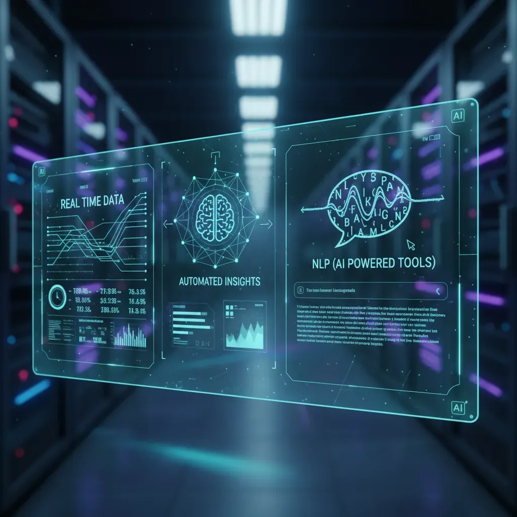
When I build an AI-Powered Business Intelligence Dashboard, I focus on features that reduce manual work and help people get answers fast. Three areas matter most: natural language querying, automated insights, and a real-time data pipeline. I also treat security and governance as a core feature, not an add-on.
Natural Language Querying (NLP)
Natural Language Querying lets me ask questions in plain English and get a chart, a table, or even a SQL snippet. This is great for non-technical users because they don’t need to learn filters, joins, or metric rules.
“Show weekly revenue by region for the last 90 days, and highlight the biggest drop.”
In many tools, the assistant can return something like:
SELECT week, region, SUM(revenue) AS revenue FROM sales WHERE date >= CURRENT_DATE – INTERVAL ’90 days’ GROUP BY week, region;
Automated Insights (Anomalies, Trends, Narratives)
I rely on automated insights to catch what I might miss during a busy week. Good AI features can detect anomalies (spikes or drops), summarize trends, and generate short narratives that explain what changed and why it might matter.
- Anomaly detection: alerts when metrics move outside normal ranges.
- Trend summaries: “Revenue is up 8% week-over-week, driven by Product A.”
- Automatic narratives: plain-language notes that can be added to dashboards or reports.
Real-Time Data Pipeline Essentials
Real-time dashboards only work if the pipeline is designed for streaming and freshness. I usually start by listing sources (app events, payments, CRM) and choosing connectors that can handle continuous updates.
- Streaming sources: event logs, clickstream, IoT, transactions.
- Connectors: managed integrations to databases, APIs, and message queues.
- Freshness SLAs: clear targets like “data is < 5 minutes old.”
| Metric | Freshness SLA | Owner |
| Orders | < 2 minutes | Data Eng |
| Marketing Spend | < 1 hour | Analytics |
Security and Governance (Trusted Answers)
To keep results consistent, I use a semantic layer with trusted metric definitions (like “net revenue”). Then I apply access controls so users only see what they should. This keeps the dashboard reliable, compliant, and easier to scale across teams.
Dashboard Creation: Lakehouse Architecture & Data Visualization (Dashboard Creation)
Choosing an architecture: lakehouse vs. traditional warehouse
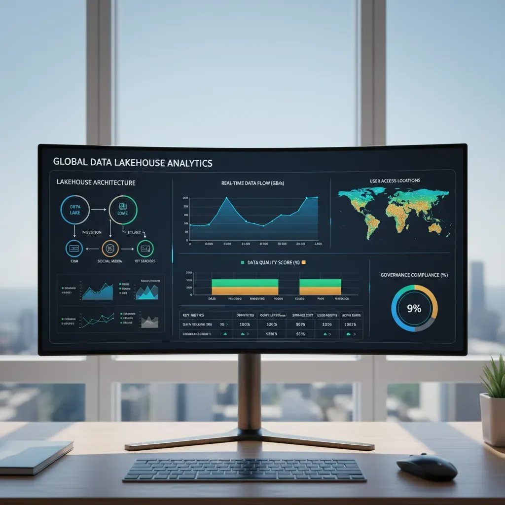
When I build an AI-Powered Business Intelligence Dashboard, I start by picking where the data will live. A traditional data warehouse (like Snowflake or BigQuery) is great when my data is mostly structured and I want strong governance and fast SQL analytics. A lakehouse (often on Databricks) blends a data lake’s flexibility with warehouse-style performance, which helps when I have a mix of tables, files, and machine learning features.
| Option | Pros | Cons |
| Traditional warehouse | Simple BI setup, strong SQL performance, mature governance | Less flexible for raw files/ML workflows, can get costly at scale |
| Lakehouse (Databricks) | Handles structured + unstructured data, great for ML + BI together | More moving parts, requires good data modeling discipline |
Design principles: clarity, hierarchy, and avoiding “chart salad”
My rule is: the dashboard should answer questions in seconds. I use clarity by limiting each chart to one message. I create hierarchy by placing the most important KPI cards at the top, then trends, then details. And I avoid chart salad (too many visuals competing) by keeping a small set of chart types and consistent colors.
- One screen, one story: keep the main view focused.
- Label directly: reduce legends when possible.
- Use color with purpose: highlight exceptions, not everything.
Drag-and-drop vs. code-first dashboards
I choose drag-and-drop tools (Power BI, Tableau, Looker Studio) when I need speed, stakeholder iteration, and easy sharing. I go code-first (Streamlit, Dash, custom web apps) when I need custom interactions, embedded AI explanations, or version-controlled dashboard logic.
My practical approach: prototype with drag-and-drop, then switch to code-first only if the product needs it.
Example pipeline: event stream → lakehouse → transformation → semantic layer → dashboard
- Event stream: app clicks, purchases, support tickets.
- Lakehouse storage: land raw events in Delta tables.
- Transformation: clean and join data (dbt or Spark SQL).
- Semantic layer: define metrics like Revenue, Retention, Churn.
- Dashboard: connect BI tool to the semantic layer for consistent KPIs.
For example, I’ll compute a daily active users table and expose it as a governed metric so every chart uses the same definition.

Interactive Dashboards & Intelligent Visualization (Data Visualization)
When I build an AI-Powered Business Intelligence Dashboard, I treat the dashboard like a conversation. The user asks questions with clicks, and the visuals answer back. Interactivity and smart charts help people move from “What happened?” to “What should I do next?” without getting lost.
Design patterns for interactivity
I start with a few predictable patterns so the dashboard feels easy to use. These patterns reduce confusion and keep analysis consistent across teams.
- Filters: I add global filters (date, region, product) at the top, and keep them limited to the most common choices.
- Drill-downs: I let users click a bar or line to go from summary to detail (e.g., Revenue → Region → Store → SKU).
- Bookmarks: I save “views” like Executive Summary or Marketing Deep Dive so users can return to a known state.
- Guided analytics: I include buttons or prompts like “Show drivers” or “Compare to last month” to guide the next step.
Intelligent visualization with smart defaults
AI helps me choose charts that fit the data instead of forcing the data into a chart. I look for visuals that adapt based on distribution and volume.
- If values are skewed, I prefer box plots or log-scale options instead of misleading bars.
- If there are too many categories, I default to “Top N + Other” to keep the view readable.
- If trends are noisy, I add a moving average line as an optional layer.
“A smart chart doesn’t just display data; it protects the viewer from wrong assumptions.”
Accessibility and mobile-ready layouts
I design for everyone, including users on phones. Responsive dashboards work best when I prioritize the essentials and remove clutter.
- Use high contrast, clear labels, and color-safe palettes (don’t rely on color alone).
- Keep mobile views to one question per screen, with concise KPI cards and short trend lines.
- Add tooltips and keyboard-friendly navigation where possible.
Data storytelling that drives decisions
I combine narrative, context, and visuals so the dashboard explains why a metric changed. I add short annotations like “Promo started here” and show targets, benchmarks, and time comparisons. This turns exploration into action, especially when the AI highlights anomalies or key drivers in plain language.
Advanced Analytics: Predictive Modeling, Anomaly Detection & Augmented Insights (Predictive Modeling)
Embedding predictive models into my dashboard
When I build an AI-Powered Business Intelligence Dashboard, I don’t treat predictive modeling as a separate data science project. I embed it directly into the same charts leaders already use. The goal is simple: show the past, the present, and a clear forecast in one place. For example, I add a “next 30/60/90 days” line to revenue, demand, or churn visuals, and I label it clearly as a prediction.
To make forecasts useful, I also include what-if controls. These are sliders or filters that change key inputs (price, marketing spend, headcount) and instantly update the predicted outcome. Even a basic approach helps decision-making because it turns the dashboard from “reporting” into “planning.”
- Forecast tiles: predicted KPI + confidence range
- Scenario filters: best case / expected / worst case
- Driver inputs: sliders for controllable variables
Anomaly detection at scale (without alert fatigue)
Anomaly detection is powerful, but it can overwhelm teams if every small change triggers an alert. I balance sensitivity by tuning thresholds and using context. For example, I compare today’s value to a seasonal baseline (same weekday last month) instead of yesterday alone. I also group alerts so people see one issue, not twenty symptoms.
My rule: fewer alerts, higher trust. If users ignore alerts, the system is failing.
| Setting | Why it matters |
| Sensitivity | Higher catches more issues, but increases false positives |
| Cooldown window | Prevents repeated alerts for the same event |
| Severity scoring | Helps prioritize what to investigate first |
Augmented analytics: narratives and root-cause hints
I like augmented insights because they reduce manual analysis. I add automated narratives that explain changes in plain language, plus suggestion engines that highlight likely drivers (region, product, channel). A simple narrative can be generated from rules like:
If revenue drops > 8% and orders drop > 8%, flag “volume-driven decline.”
Operationalizing ML: retraining, drift, and governance
To keep predictions reliable, I set a retraining cadence (weekly or monthly) and monitor drift—when input data or outcomes change over time. I also document model owners, approval steps, and version history so the dashboard stays auditable and safe to use.

From Prototype to Production: Step-by-Step Operationalization & Business Monitoring (Business Monitoring)
When I build an AI-Powered Business Intelligence Dashboard, the hardest part is not the first demo—it’s making it reliable enough for daily decisions. To move from prototype to production, I follow a simple operational checklist. First, I define the KPIs in plain language, including how each metric is calculated and what “good” looks like. Next, I select a platform that fits my team’s skills and budget, then I map data flows end to end: sources, transformations, storage, and the final dashboard layer. After that, I build a small MVP with only the most important views, and I iterate with real users weekly so I can remove confusion early and keep the dashboard focused on action.
Once people depend on the dashboard, monitoring becomes a business requirement, not a technical extra. I set basic SLAs around uptime and data freshness, because stale data can be worse than no data. I also add failure alerts for pipeline breaks, API limits, and model errors, and I document countermeasures so the response is consistent. For example, if the data load fails, I want an alert that tells me what failed, what tables are impacted, and whether the dashboard should show a warning banner until the next successful refresh.
Governance and compliance are what keep trust high. I use access controls so teams only see what they should, and I enable auditing so I can answer who viewed or changed key assets. I also treat the semantic layer like a product: metric definitions, naming rules, and version control. If “Revenue” means different things in different places, the dashboard becomes a debate tool instead of a decision tool.
As adoption grows, I plan for scale. Embedded analytics helps me bring insights into the tools people already use, and multi-tenancy matters if I support multiple departments or clients with separate data boundaries. Performance tuning is ongoing: I cache common queries, optimize models, and watch costs so the dashboard stays fast without surprises.
My goal is simple: a dashboard that is accurate, monitored, and trusted—so the business can act with confidence.
Choose target KPIs, pick a platform (lakehouse vs. warehouse), connect streaming data, add NLP & automated insights, embed predictive models, and monitor SLAs.


