I still remember the day our marketing team asked me for a ‘single source of truth’ dashboard that updated in real time. I tried three platforms — Tableau, Power BI and Looker — and learned that picking a BI tool feels a bit like choosing a car: utility matters, but personality and maintenance matter too. In this post I walk through AI features, modeling, integrations and the human trade-offs I found while testing each platform.
Head-to-head snapshot: Which platform wins what?
When I compare AI Analytics Platforms side by side, I try to keep it simple: each tool “wins” in a different situation. The best choice depends on how your team works, how strict your data rules are, and how much you want people to explore on their own.
Quick strengths at a glance
| Platform | Where it wins | Best fit |
| Tableau | Best-in-class visualization and fast visual exploration | Analysts who need ad-hoc answers and strong storytelling |
| Power BI | Cost value + tight Microsoft tie-ins (Excel, Teams, Azure) | Organizations already living in Microsoft 365 |
| Looker | Data modeling + embedded analytics with governed metrics | Teams that need one trusted metric layer across products |
Speed vs. flexibility (where the trade-offs show up)
Tableau shines when I want to move fast: connect to data, drag-and-drop, and explore patterns without much setup. It’s great for ad-hoc visual analysis, especially when the question is still fuzzy and I’m trying to “see” the answer.
Looker is different. It tends to win when the business needs consistent definitions—like “active user,” “net revenue,” or “churn”—across many dashboards and teams. With LookML, I can define metrics once and reuse them everywhere. The trade-off is that it can feel slower at the start because modeling takes planning.
Power BI often lands in the middle for me: quick enough for many teams, and very practical if your data and identity already run through Microsoft. It’s also hard to ignore the pricing and licensing simplicity for companies already paying for Microsoft tools.
My real-world swap: Tableau to Looker
I once helped move a team from Tableau to Looker. The biggest win was fewer metric disputes—people stopped arguing about whose dashboard was “right” because the definitions were centralized. But I also saw slower dashboard delivery early on, since we had to build and review the LookML layer before self-serve really took off.
Practical takeaway
- If you need self-serve speed and visual discovery, I lean toward Tableau.
- If you want low friction with Microsoft and strong value, Power BI is tough to beat.
- If you need governed BI, consistent metrics, and embedding, Looker usually wins.

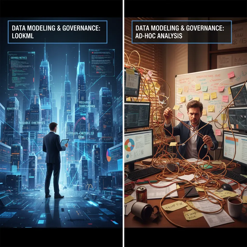
Data modeling and governance: LookML vs ad-hoc analysis
When I compare AI Analytics Platforms like Tableau, Power BI, and Looker, I always come back to one question: where do our metrics live? If the answer is “in each analyst’s workbook,” you will eventually get KPI drift. If the answer is “in a governed model,” you get consistency, but you also take on more upfront work.
Deep dive into LookML (Looker): strong governance, real learning curve
Looker’s big differentiator is LookML, a modeling layer that defines dimensions, measures, joins, and business logic once, then reuses it everywhere. The upside is reproducible metrics: “Revenue” means the same thing in every dashboard, explore, and alert.
- Reproducible metrics: one definition, many reports.
- Version control: LookML projects can be managed with Git, so changes are reviewed and tracked.
- Governance by design: you can limit what fields users see and how they combine data.
The trade-off is the learning curve. To be effective, I usually need SQL knowledge and comfort with a developer workflow. Even simple changes can require a pull request mindset, which is great for control but slower for quick experiments.
Tableau and Power BI: faster ad-hoc work, but consistency takes discipline
Tableau supports a semantic layer through data sources, relationships, and (in many teams) published data sources or Tableau Prep flows. It’s flexible and friendly for exploration, but I’ve seen logic duplicated across workbooks when governance isn’t enforced.
Power BI leans heavily on its data model with relationships and DAX measures. When a team centralizes datasets and reuses measures, it can be very governed. But if everyone builds their own PBIX files, definitions can diverge quickly.
A real example: fixing a sales metric mismatch
I once found “Net Sales” showing three different numbers across three dashboards. The issue was small—each report handled returns and discounts slightly differently. I rebuilt the metric in LookML as a single measure and reused it everywhere:
measure: net_sales { sql: ${gross_sales} – ${returns} – ${discounts} ;; }
That one change removed the mismatch and stopped future rework.
My advice: model early if KPIs must match
If multiple teams report the same KPI, I prioritize data modeling early—even if it slows the first dashboard.
For AI-driven insights to be trusted, the underlying definitions must be stable. Governance isn’t a “nice to have”; it’s what keeps analytics credible at scale.
Visualization, UX and custom visuals: hands-on exploration
When I compare AI Analytics Platforms, I always start with the daily experience: how fast I can build a view, how easy it is to explore, and whether the visuals can match the story I need to tell. Visualization and UX are not “nice to have” features; they decide how quickly insights move from an idea to a dashboard people actually use.
Tableau: rapid prototyping with drag-and-drop
Tableau’s drag-and-drop interface is still the fastest for me when I’m exploring data. I can pull dimensions and measures onto shelves, switch chart types quickly, and iterate without thinking about structure too much. It also supports advanced customization through calculated fields, parameters, and flexible formatting, which helps when a standard bar chart is not enough.
Power BI: strong defaults plus a custom visuals marketplace
Power BI feels more guided. The built-in visuals are strong, consistent, and easy to style for business reporting. When I need something special, the custom visuals marketplace gives me options (with the trade-off that I have to check quality, performance, and security). For teams that want a standard look across reports, Power BI’s UX can be a real advantage.
Looker: improving visuals, but model-centric by design
Looker’s approach is different. Visualization is improving, but the platform is more model-centric. Before I get the perfect chart, I often need to think about the semantic layer and how metrics are defined. That can be great for consistency, but it slows down quick experimentation compared to Tableau or Power BI.
My hands-on experiment: the same marketing funnel in three tools
I built the same marketing funnel dashboard (visits → leads → MQLs → SQLs → customers) in each platform. My timing looked like this:
| Tool | Time to build funnel | What slowed me down |
| Tableau | ~30 minutes | Mostly polishing labels and tooltips |
| Power BI | ~45 minutes | DAX measures and layout tuning |
| Looker | ~1.5 hours | Modeling + defining metrics before visuals |
My main takeaway: if your work depends on custom visual needs and high interactivity for exploratory analysis, Tableau often leads. If you prioritize standardized reporting with lots of ready-made visuals, Power BI is very competitive. If governed metrics matter most, Looker’s modeling-first workflow can be worth the extra setup time.

AI features and natural language: who understands your questions?
In 2025, the big shift across AI Analytics Platforms is that dashboards are no longer the only interface. More and more, I can type a question in plain English and expect a useful answer, plus a chart, plus a short explanation. The difference is how well each tool understands my intent and how clearly it shows the logic behind the result.
What’s new in 2025: Tableau and Looker lean into assistants
Tableau’s newer AI direction is often described through Concierge AI, which aims to help me explore data with guided prompts, suggested views, and faster “next best question” paths. In practice, it feels like Tableau is trying to reduce the time between curiosity and a usable visualization.
Looker is also moving fast by integrating generative AI via Gemini models. The promise is simple: I can ask questions conversationally, generate summaries, and get help writing or refining metrics logic. For teams already in Google Cloud, this can feel like a natural extension of the stack.
Power BI’s approach: Microsoft AI building blocks
Power BI’s AI story is broader and more “platform-like.” I see three pillars show up most often:
- Azure Machine Learning integration for training and deploying models that feed reports
- Q&A natural language for asking questions directly on reports (with varying success depending on the data model)
- Predictive analytics patterns through built-in visuals and model outputs
My quick test: one question, three answers
I asked each platform the same question: “What were the top 3 drivers of churn last quarter, and how confident are we?” The results varied.
- Tableau gave me strong visual suggestions and helpful follow-up prompts, but I still had to confirm definitions (like what counts as “churn”).
- Power BI was best when my semantic model was clean; otherwise, Q&A could misread terms and return a chart that looked right but wasn’t.
- Looker produced the most readable narrative when metrics were well-defined, but I watched closely for assumptions in the generated explanation.
My rule: AI can speed up analysis, but it can’t own the truth of my data.
Tip: treat AI suggestions as accelerators, not replacements. I validate the metric definitions, check filters, and spot-test outputs against a known report before I share anything.
Integrations, embedding and cloud architecture
When I compare AI Analytics Platforms, I always look at three practical things: how easily they connect to my data, how well they embed into apps, and how “cloud-ready” the architecture feels in day-to-day work. These details often matter more than flashy AI features, because they decide how fast a team can ship dashboards and keep them reliable.
Looker: cloud-native with warehouse-first design
Looker is cloud-native and works best when your data already lives in a modern cloud data warehouse. In my experience, it shines with BigQuery and also supports warehouses like Amazon Redshift, which makes it strong for near real-time analysis where you want queries to run directly on the warehouse.
Because Looker is designed around a centralized modeling layer, it fits teams that want consistent metrics across many embedded views. It also tends to feel “API-forward,” which matters when analytics is part of a product, not just internal reporting.
Tableau: broad connectivity and flexible deployment
Tableau connects broadly to many data sources, which is helpful when I’m dealing with mixed systems or a company that is still migrating to the cloud. It integrates well with cloud warehouses like Snowflake and BigQuery, and it also supports many databases and files that show up in real organizations.
For cloud architecture, Tableau Cloud is a major deployment target. I’ve seen teams choose it to reduce server management while still keeping strong visualization workflows and a wide connector ecosystem.
Power BI: best fit for the Microsoft ecosystem
Power BI ties tightly into the Microsoft stack, especially Azure and Office 365. If your identity, governance, and collaboration already run through Microsoft tools, Power BI often feels like the shortest path from data to business users.
For embedding, Power BI Embedded is a clear option when you want to place reports inside a custom application with managed capacity and Microsoft-native controls.
Embedding and integration takeaways from my projects
- Looker: My embedded analytics projects favored Looker when we needed flexible APIs and strong Google Cloud integration.
- Tableau: I pick it when I need broad connectors and strong self-service exploration across many sources.
- Power BI: I lean toward it when the organization is already standardized on Azure and Microsoft security and collaboration.

Pricing, market trends and real-world recommendations
When I compare AI Analytics Platforms in 2026, pricing is the first place where teams get surprised. Tableau, Power BI, and Looker all look reasonable at the start, but the real cost shows up when you scale users, refresh data more often, or embed dashboards into products. I always plan around three pricing layers: license types (creator vs viewer vs admin), embedded costs (if customers will see analytics inside an app), and scaling fees tied to data volume, compute, and concurrency. If you expect many people to open dashboards at the same time, or you need near-real-time updates, I treat that as a pricing multiplier—not a small add-on.
Market trends are pushing all three tools in the same direction. I’m seeing faster adoption of AI-powered analytics and cloud-native BI, especially as companies move data to modern warehouses and want self-service insights. The 2025 updates across the category leaned into semantic learning (tools understanding business meaning like “revenue” or “active user”) and generative features that help people ask questions in natural language, summarize dashboards, and draft explanations. That’s helpful, but I still treat AI as an assistant: it speeds up analysis, yet governance and data definitions still decide whether the answers are trusted.
In real-world use, my recommendation is simple. For small teams or startups watching spend, I often see them start with Power BI because it’s cost-effective and fits naturally when Microsoft tools are already in place. For analysts who live in visual exploration and want to iterate fast, Tableau remains a favorite because it makes discovery feel natural and flexible. For data platforms that serve many consumers—especially when metrics must be consistent across teams—Looker tends to win because the modeling layer supports shared definitions and controlled self-service.
My closing advice: choose the platform that matches your operating model, not just the best demo.
Before I finalize a decision, I check whether my team has strong SQL/LookML skills, whether we need embedded analytics, what concurrency will look like at peak usage, and how much the Microsoft or Google ecosystems matter for identity, security, and deployment. If those answers are clear, the “best” AI analytics choice usually becomes obvious.
Tableau wins for visual exploration and ease-of-use, Power BI delivers strong value and Microsoft ecosystem tightness, and Looker excels at centralized modeling and embedded analytics—pick based on team skillset and cloud needs.


